Category: Theorizing

Original analysis and metaphors on ADHD.

If I ever publish a coaching book, these posts will be in it.

  • How to Drive a Manual Brain

    How to Drive a Manual Brain

    Perhaps I should resume this new blog by telling you why I am specializing on ADHD coaching; but, since I left a hint on my previous post and recently someone asked me “What is an ADHD coach”, my brain took another turn.

    Thinking about an answer to that question, as I was driving the other day (I drive stick), a metaphor pop up in my head; I’d say I thought something like, “OMG; a neurotypical brain is like an automatic car and a neurodivergent brain is like a manual car; and just like you go to an instructor to learn how to drive, we go to an ADHD coach to guide us on learning about the particularities that are behind driving a “manual brain.”

    Then, I did my best to explain it.

    Quick Intro

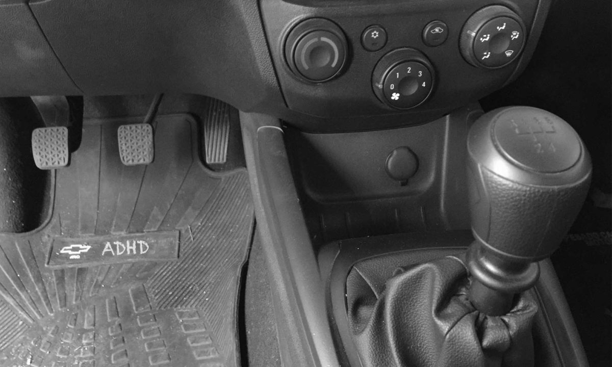
    I’ve been driving stick since I learned how to drive, and I love it so much that when I drive a manual car I feel I’m not driving (it’s so easy that is boring!) To do so, as I’ll explain, one must learn how to use three pedals and a stick shift with seven positions, and also how to listen to the engine; the sound of the engine is what tell us what do next.

    It’s like becoming one with the car; one must be completely aware that we’re driving… and this, this makes every ride so much enrichening…

    Now, bear in mind this: a manual and an automatic car are the same (mostly). A few years ago, I got a brand-new Chevrolet with a payment plan and the dealer asked me, “Will you be taking the automatic or the manual one?” The question was simple because the difference between them were superficial (like, having a button to “roll down the window” or not ); but they both had the same horses, the same motor, Bluetooth! Therefore, the main difference relies on how to drive it.

    How to Drive a Manual Car

    Attention peeps! This is cool; in a manual car, there are:

    •  three pedals; from left to right:
      • the clutch (which you press with your left foot)
      • the brake, and the gas or accelerator (which you press with your right foot)
    • and the stick shift has different positions 
      • reverse and five velocities
      • neutral gear
    My manual car ☺️

    And this is how you drive it:

    1. Enter the car and make sure the shift stick is on neutral;
    2. Put the keys on and start the engine; (well, duh)
    3. Press the clutch pedal and while you’re pressing it move the stick to “1”; release the clutch smoothly as you press the gas to drive for half a block or so; you’ll hear the engine asking you for more; then you:
    4. Press the clutch pedal again, move the stick to “2” and press the gas to drive for two blocks or so (always listening to the engine) And once again you,
    5. Press the clutch pedal, move the stick to “3” and – finally – press the gas and start enjoying the ride.

    Then if you:

    • want to go faster: continue pressing the clutch pedal and switching to “4” and then “5”, always listening to the engine;
    • need to stop: press the clutch pedal, move the stick to neutral and press the break.

    Bear this in mind: when you are pressing the clutch pedal to move the stick, you must release it very slowly while pressing the gas; you can’t simply lift your left foot because the car will choke. If you think about it, it’s like learning a choreography.

    It seems a lot… It is a lot; but once you get used to it, it comes naturally; what’s more difficult to learn is to listen to the engine to see when it needs more gas, and how to carefully transition from the clutch to the gas without choking the car.

    An ADHD brain, works exactly like that.

    Driving a Manual Brain

    A neurotypical brain, which is automatic, is easy to drive; you put the keys on, move the stick shift to D and press the gas to “just start driving.” A neurodivergent brain, on the other hand, is manual… and it needs more of our help.

    First, we must decide to get into the car and that is a huge deal; if where we must go is not of our interest, we won’t even bother to find the keys we’ve left “somewhere.”

    Then, we must be aware that we are driving and pay attention to the sound of the engine telling us how much power it needs; and of course, to the signs, the other cars and to those people who don’t cross the street from the corner!

    When we make a switch, we must do it smoothly and step by step; we cannot go from 1 to 3; we must change our gears step by step: 1, 2, 3, 4, full power!

    And, if an old lady wants to cross the street – and we have to release the gas, press the clutch pedal, move the shift stick to neutral and press the stop pedal – by the time grandma gets to the sidewalk, we may have forgotten where we were going to or lose interest in it; hey, we may even go back home thinking, “why did I go out in the first place? Oh… Toilette paper!”

    There is a lot more to it; but the fundamentals of driving a manual brain relies on this: 

    • having interest in going somewhere; 
    • starting with a pause;
    • being aware that we are driving (where to; what’s around us); 
    • listening to the engine to see what it needs; 
    • paying attention also to the transition process to switch gears;
    • do things one by one, following an order;
    • forgive the old lady without having a meltdown.

    So, What’s an ADHD Coach?

    It’s a neuro instructor! Is a person that will guide us to understand how this manual brain works so we can go to the moon and back because, …, yes, manual brains can also fly; and some of them can do it really fast.

    My Jalopy

    While driving a manual brain, we may feel that we’re stuck with a jalopy, with that old car our great grandparent got at an auction… and do you know what? In a way, we are; because when we get in, we see it’s full of surprises, treasures we never imagined there could be.

    In mine, I found in the trunk a map to a fantasy world where only I can go and where I can fly; under the driver’s seat, there’s a mysterious formula that makes my brain race at the speed of light and it’s hyper-awesome! The ceiling is covered with countless pictures of places, people, and things I long to visit, see and feel… And the wheel! O-M-G; the wheel has a silly smiley face over the horn, so every time I run into something that gets in my way, I smile ☺️

    A neurotypical person may wonder, “All of that?” and I’d reply, “Not even close.”

    I drove like an F1 driver for twenty years; with purpose, listening to my engine, being aware of everything around me and absorbing the knowledge from every person I’d meet and their new stories… But then, I crashed more times than I’d have expected.

    During my mid-twenties, I forgot about the cooling system and it ran out of water; and I kept pressing the gas to keep going – without listening to engine – until I broke my manual brain… Life, traumas and my own bad choices literally choked my brain until it went: “kaboom.”

    Maybe if I had known there was also a cooling system I needed to care of, I wouldn’t have failed; but then again, I wouldn’t be here telling you: “Even if you crash your brain into pieces, you can fix it.”

    Last but not least, I never lose my keys; I attached them to something big that I cherish, to something that brings me happy thoughts, so they are always at plain sight.

    … If you’d ask me, driving automatic is totally overrated.

    cark keys with a big cat keychain
    I was not lying ☺️ © neurodivergent.blog
  • ADHD and the Use of Sans Fonts: Do They Make a Real Impact on the Legibility?

    ADHD and the Use of Sans Fonts: Do They Make a Real Impact on the Legibility?

    I’ve got a question for you: while studying or working, have you ever noticed that sometimes it’s easier or more difficult to read, but you don’t know why?
    Have you ever opened a webpage or a book and felt, “I can’t read this,” even though you were really interested in it?

    I have — and I’ve found that our inability to focus on something we need and want to read could be related to the type of font used in the text. In my case, it actually is.

    Check out these two screenshots and see which one seems more compelling to you, more soothing to your eyes:

    (Click to enlarge)

    Did you feel a difference?

    What Matters in the Legibility of a Text?

    In any given copy, what matters the most is basically:

    • the type of font (for instance, Times New Roman is a “serif” font, while Arial is a “sans” font),
    • the line height (the space between lines in a paragraph), and
    • the color (the contrast between the text and its background).

    For the purpose of what I’ll be sharing with you, we’re going to assume that a text has a nice line height and color contrast, and we’re going to focus on the difference in the type of fonts.

    The Difference Between Serif Fonts and Sans Serif Fonts

    Among the different types of fonts [1], the two most commonly used are the serif fonts and the sans serif fonts.
    The main difference between them is the small lines attached—or not—to the letters: serif fonts have these lines, while sans fonts don’t.

    adhd fonts

    Serif fonts give us a sense of professionalism—an old-school kind of writing—while sans fonts look more informal, but also clearer.
    We could go deeper to discover more differences [2], but our eyes don’t lie. Here’s a list I made of my favorite fonts:

    Learning How to Write and Read

    I began noticing the difference between those fonts when I was in Law School. Presenting our papers in Times New Roman was mandatory and, for some reason, there was something about it that bothered me. Eventually, I tried writing in Arial and felt something like, “Wow, now I can see.”

    I’m going to take you a little bit back in time so we can understand where this difference comes from and why it matters.

    From Block Letters to the Cursive Style

    When we’re children, we begin learning to write with block letters—which is no surprise: we learn the letters of the alphabet one by one, and then we start putting them next to each other to create words. Eventually, teachers make us move on to the cursive style because “it looks more professional and that’s how adults do it.” [3]

    I switched from pencil to pen, and from block letters to cursive style, during my first year of primary school. I remember many of my classmates (if not most of them) struggled a lot with the change, but I didn’t. Calligraphy class was “art” for me; I wanted to be a writer, and that was my pass. I simply loved it.

    I also believe—when it comes to my ADHD—that the change wasn’t difficult for two more reasons:

    • one, the high-protein diet we need is basically the daily diet in Argentina (where I grew up);
    • two, my need to drain hyperactivity so I could focus was also being taken care of. I was outside climbing trees and running all day long, and I started doing sports at seven.

    From Analog to the Screen

    I loved writing in cursive, but it was hard to read from it. So when I got to college and had the freedom to take notes however I liked, I started writing with block letters again and left the ink for the sinful Bic rollerball pen (I went to a private Catholic school; using a rollerball pen was a ticket to the confessional).

    But later, technology arrived. We had to start typing our papers on computers using the mandatory Times New Roman font. During the late ’90s, it was “trendy” when trendy wasn’t even a word—and I simply didn’t like it. It didn’t feel like my own writing.

    Somehow, at some point, I typed my notes using the Arial font… and it felt different. I printed them and studied from them, and—as I said—I felt I could finally see. The text looked so clear, as if I didn’t even need to pay full attention to what I was reading because the keywords just popped out from the text. So, I stuck to it.

    What’s Out There: Designing for ADHD

    When I started writing again and opened my blog, I used the Adobe Carlson font (a serif font). That’s the one The New Yorker—one of my favorite magazines—uses, and I love it. In fact, serif fonts are so beautiful that most websites with serious writing, so to speak, use them.

    But then, after publishing my second post one day I tried to read it and couldn’t get to the second paragraph—of my own post! And so that old thought came to mind: “Arial’s clarity,” and the question, “Could the font style be messing with my legibility?”

    Besides Poole (2020), who wrote about the legibility of serif and sans serif fonts [2], I believe McKnight (2010) is worth reading. In Designing for ADHD: In Search of Guidelines, she mentions the use of “large print (12–14 point) and clear sans-serif fonts such as Arial.” [4]

    I went over the bibliography she used, dug a little more, and found that this idea comes from guidelines used to print children’s books. Sans fonts are clear for children, and that’s why designers use them. The literature on that is quite abundant, but when it comes to legibility for neurodivergents (with ADHD in this case), there’s a huge void.

    My ADHD and the Rounded Fonts

    After reading the first study, I didn’t think twice. I downloaded the Open Sans font (by Google) and installed it on every single software I use—and I saw the light. A whole paragraph was suddenly clear as water, making it easier for me to pick out keywords.

    Still, it was a big change for me. At first, I even felt I wasn’t writing “something worthy of a writer,” but then… look at me posting!

    Later, I paid a visit to my psychiatrist—who has ADHD too—and without giving him a hint, I started asking about his experience in Med School. I believe the first thing he said was, “I hated Times New Roman!”

    My ADHD gut never lied to me (it’s one of our superpowers!). So, before I procrastinate and jump into writing a thesis, I’ll leave my humble hypothesis here:

    “The use of sans fonts improves legibility for people with ADHD.”

    Improving the Legibility for People With ADHD

    As I said at the beginning, many factors influence the legibility of a text besides its font—such as line height and color contrast. Furthermore, when we visit websites with pop-ups, inconsistent color palettes, or when we read PDF files filled with huge logos and images, all that really gets in the way of our attention.

    The world has changed, and we don’t know if or when things will be as they were. Now we find ourselves living in front of screens and teaching our children through digital devices—when the ADHD brain craves the analog.

    Thus, if the use of sans serif fonts influences legibility for people with ADHD, this could have a huge impact on our lives. Just by changing the fonts I use, my quality of life changed. I’m a writer; all I do is read and write—and now I can do it effortlessly.

    I humbly believe that now, more than ever, this should at least be a topic worth discussing.


    If you’ve read something or know better than I do, or if you think you could help with this research (by defining variables, etc.), please enlighten me in the comments or contact me.

    If you’d like to try the fonts on your computer, check out how to install them from my Blogging Toolkit.


    Footnotes and References

    1. Adobe classifies fonts into eight (8) categories, and Google into five (5).
    2. Poole, Axel. Which Are More Legible: Serif or Sans Serif Typefaces? [Last visited: May 2020].
    3. Rueb, Emily (2019). Cursive Seemed to Go the Way of Quills and Parchment. Now It’s Coming Back. The New York Times. URL: https://www.nytimes.com/2019/04/13/education/cursive-writing.html [Last visited: May 2020].
    4. McKnight, Lorna (2010). Designing for ADHD: In Search of Guidelines. URL: http://homepage.divms.uiowa.edu/~hourcade/idc2010-myw/mcknight.pdf [Last visited: May 2020].