In 2020, I published “ADHD and the Use of Sans Fonts: Do They Make a Real Impact on Legibility?” Since then, it’s become one of the most-read posts on this blog — which tells me that many hyper-neurodivergents are indeed wondering which is the best font for ADHD.
I also believe that the original article may be too technical, so here’s an ADHD-friendly version of it, along with a few reflections and a cool note on a font designed for dyslexics.
Please note: this discussion is about trying to read something we’re interested in — but just can’t. For a deeper understanding, check out the original post first.
What are the Styles of Fonts?
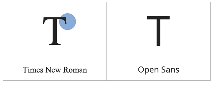
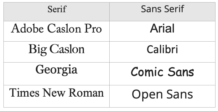
For the purpose of this discussion, I focused on two: the “Serif” fonts (those with curly ends) and the “Sans” fonts (those without).
Is There a Best Font for ADHD?
To this date, there’s no research confirming the existence of an ADHD-friendly font, or whether the use of certain fonts could help neurodivergents at all.
However:
- I made my case that sans fonts are the most ADHD-friendly, based on my own experience, Dr. K’s, and an article published by McKnight (2010).
- I recently discovered a new font created for dyslexics (who are also neurodivergent).
- And the fact that so many people Google “ADHD fonts” and end up here — well, that says a lot.
Why “Sans” is the Best Font Style for ADHD?
Previously, I mentioned a subjective reason: for me (and Dr. K, who is also ADHD), sans fonts are clearer. Now I’d like to explain why.
Is This Impulsivity?
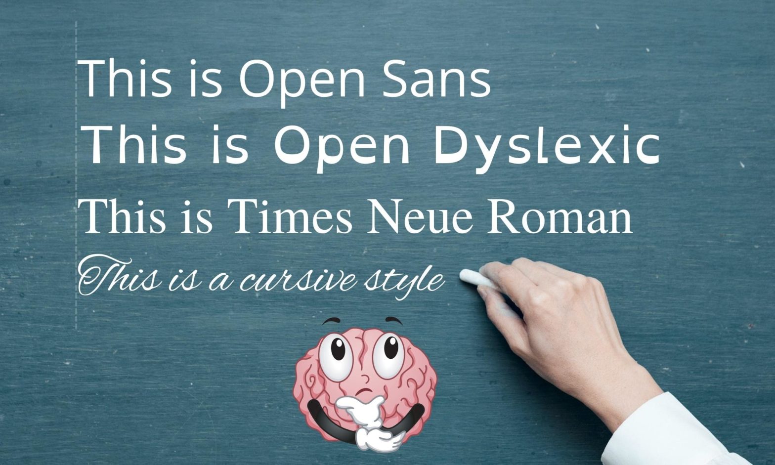
Basically, text written in a serif font (like Times New Roman) looks like a blur of words my brain can’t distinguish:
- A paragraph feels like a single block of words, so
- keywords don’t pop out at first sight, and
- I feel a rush to move on to the next paragraph.
A copy not written in sans fonts — even when I’m interested in it — doesn’t help me read word by word. I get eager to move forward, and I end up reading nothing.
Is This Distractibility?
Here’s another funny thing that might sound silly: as a blogger and web designer, I love serif fonts. As a writer, they make me feel more “writerly.” So here’s what happens:
Sometimes, when I’m reading The New Yorker’s website — which has the most beautiful serif font — I start wondering if “maybe now I could use it.” I then spend a good amount of time searching for a free look-alike version, only to try it and think, “You’ve procrastinated again.” 🤦🏻♀️
How to Choose an ADHD Friendly Font? Procrastination Alert

When searching for a font for ADHD, we can easily end up procrastinating — looking for the prettiest, most popular, or most recommended. Been there, done that.

“Reading is your goal.” Keep that in mind.
A humble suggestion:
- Start with Open Sans.
- Stick with it for at least a few days.
- If you’re still struggling, try another one.
Also remember that font size and line spacing (or “line height” on websites) matter.
In Microsoft Word, I use size 12 with multiple line spacing set to 1.7 (1.5 isn’t enough — and it makes a huge difference for me). I also write with the zoom at 170% to avoid using my glasses. 🤷🏻♀️
Is There Something Written about the Use of Sans Fonts for ADHD?
So far, I’ve only found guidelines for designing books for children.
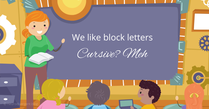
As I mentioned before: “When we’re kids, we start learning to write with block letters — which makes perfect sense: we learn the alphabet one letter at a time, and only then do we begin to put them together to create words.”
One letter at a time is what my ADHD brain needs — and I realized this in law school (undiagnosed, by the way).
Recently, I was surprised to learn that there are other neurodivergents who need exactly the same: those with dyslexia.
Dyslexic Friendly Fonts and Its Relationship with ADHD Friendly Fonts
For dyslexics, words themselves are the issue. Fortunately, there has been a lot of progress in the digital world to support them.(1)
One of the things that struck me the most was the development of a font designed specifically for their needs.
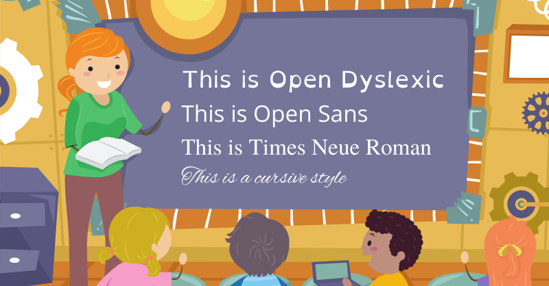
As you can see in the image, “Open Dyslexic” (2) has letters that are:
- wider (the x-axis is increased), which consequently increases the space between the letters, and
- heavier at the bottom so that dyslexics don’t flip letters such as b and p.
One letter a time…
How to Change the Font When We Cannot Change Them?
If you’re reading from a website or book written in serif fonts and it’s giving you a headache, here are a couple of solutions:
- Reading from a website: Safari, for instance, lets you choose “Reader View.” This provides clean text displayed in a sans font.
- Reading from a book: I scan it, export it as a PDF, and use Adobe Acrobat Pro to change the font. Does it take forever? At first, yes — but I need to read.
Wrapping It Up
Since there’s no research on this topic yet, give sans fonts a try.
Open Sans, by Google, is free to download and install. You might also want to try Roboto, which is thinner.
If this works for you, please help me — help us — spread the word!
Footnotes
(1) In 2008 Dutch designer Christian Boer (who is dyslexic himself) designed the font “Dyslexie”. He presented it at a TED Talk in 2011.
(2) The font “Open Dyslexic” was designed by Abelardo González and released as open source — meaning you can download it for free.
Leave a Reply
You must be logged in to post a comment.